Are you 'Visually' ARTICULATE?
- Mark Cunningham

- Jul 9, 2021
- 6 min read
Updated: Jul 12, 2021
This is my second blog post in a series dedicated to best practice visual design. You can find the first post 'Telling Stories with DATA' by clicking on the link.

Being articulate is a key trait of any good presenter or story teller as it allows them to clearly express themselves in a way that is easily understood.
Although 'being articulate' is associated with the written and spoken word, it is also critical in how we display data. As a business analyst you have to do more than merely present a set of numbers. You have to clearly express them in an easily consumable and understandable way. Simply put, you need to present the data in a way that visually tells its story so the reader can immediately understand. You have to be Visually Articulate.
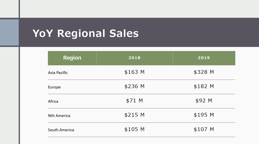
Here is a simple example: In preparation for a quarterly business review, analysts will often take the numbers direct from finance and simply copy them into a PowerPoint slide. Sure, the table shows a company's revenue by region but this requires a lot of cognitive effort to understand what the story in the data is.

Is the Analyst doing a disservice to their audience by just presenting a table? There is a story here and it needs to be told but it often needs help to be told.
What is the story and how 'could' it be better told?
Take a look at the following.
I think most would agree that the chart above does a better job when compared with the table. Immediately it is clear that Asia is the best performing region, whereas Europe is the worst. The call to action becomes clear - continue to look at Asia to lead the way. This chart is what I would classify as more 'Visually' Articulate than a table. The audience is able to intuitively understand the message and the call to action which are expressed clearly. On the other hand, the table requires more effort by the audience to infer what the insights might be.
How to become more 'Visually' Articulate?
So how do you become 'Visually' Articulate? It is easier than you think, and it is definitely something that can be learned.
One of the best recommendations I could make is to go and buy the following book written by Cole Nussbaumer Knaflic
This is one of the best reference guides you can have on your book shelves as it does a great job of introducing key visual design concepts to be used in your design. Below is a summary of the key concepts and how they can be incorporated into your Power BI report build.
Choosing the right 'type' of Chart
Pre-attentive Visual Properties
Gestalt Principles of Design
Let's work through each in more detail.
Choosing the right 'type' of Chart:
To be Articulate, you need the right vocabulary. The Financial Times created the following quick reference guide which they aptly named the 'Visual Vocabulary'. This lists most of the key visuals required to communicate effectively with data and gives you an understanding of what should be used and when. What you use will be dependent on the insight and how you want to convey it.
This is a great reference. However, what is even better is Jason Thomas's recreation of this in Power BI (see interactive report below). Although published back in Dec 2018 (which is an absolute eternity ago given the monthly frequency of Power BI releases), this is still one of the best tools out there for reviewing and selecting the right chart types. Although not all are native to Power BI, there are many custom visuals that are available on the app source store, plus Power BI is extensible by using Python, R or Charticulator, which is a brand new custom visual that can be used to create the visual you need.
Pre-attentive Visual Properties:
These techniques leverage the way our brains are wired to process visual information subconsciously. By using pre-attentive properties in your design you can highlight the most important aspects of your data visualization and direct the story being told. Simply put, the more of your story you can tell using these techniques, the faster and better your user will 'get it'. The 4 main pre-attentive attributes that can be used are as follows:
Color
Form
Position
Motion
I won't go into detail on these because many others have already written about these. Here is one blog which does an excellent job of introducing these pre-attentive design principles and gives some simple examples to show how they work with data.
Fair warning though - don’t overuse these techniques as you can easily mess up understanding by triggering too many pre-attentive processes.
Gestalt's Principles:
These are very powerful when applied appropriately. They are a set of principles that work with, and are built from, the pre-attentive properties above. There are 7 principles which are shown below:

Again I am going to point you to the excellent work by others as they will do a much better job of explaining and providing examples than I can. Out of the numerous resources, the following post ( click here ) does a great job explaining how these principles can be best used to improve your data visuals.
Pulling it all together in Power BI
Remember our example?

Let's see how we used the Visual Vocabulary as well as the pre-attentive and Gestalt principles of design to better Articulate our data story in Power BI.
Step 1: Choosing the appropriate chart type: Chart selection will depend on the data you have and the story you want to tell. In this case we want to show how revenue has changed over time. When reviewing the options in the Visual Vocabulary, it is clear that the slope chart best suits what we want to show - highlighting each region's change between two periods to show either growth or decline.

Step 2: Building the Visual in Power BI - Using the Power BI Line Chart

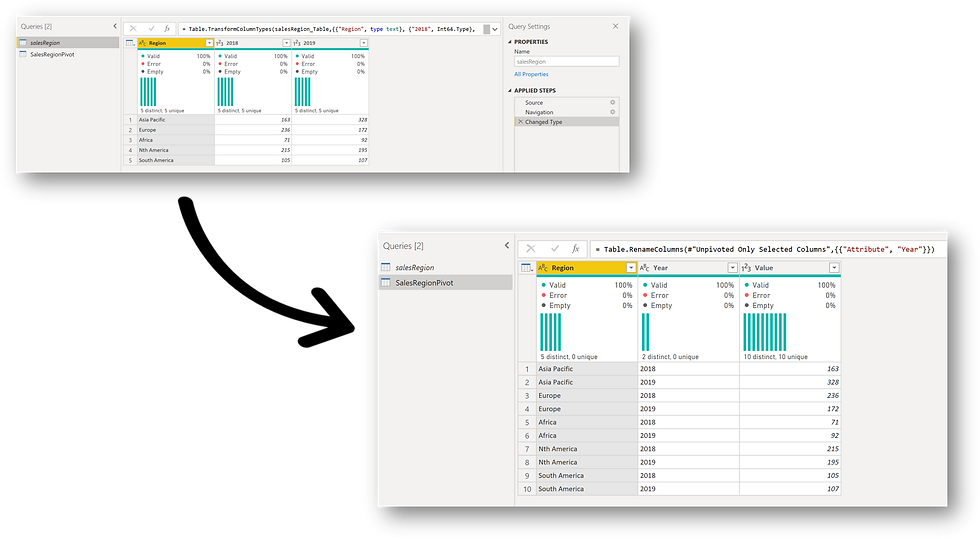
Shape the Data: To create this type of visual in Power BI we can use the native line chart. As a first step we need to ensure that we get the data into the right shape so it can visualize it with the line chart. In this example we can do this by pivoting the data so all the values are in one column.
Create the Visual: With the data in the right shape, creating the visual is as simple as putting the year in the axis, a new explicit measure of Total Sales in the values, and Region was added as the legend.
The visual was created using the following principles;

Color: This has been used as a pre-attentive driver to quickly highlight the important data on the chart and draw the 'eye' to what we want to show. In this case the Region with the largest growth and largest decline from one year to the next. The other data is still displayed, but by using a grey which pushes the information into the background, thus decreasing the clutter on the chart.
In this example, this was simply accomplished by using the formatting panel to change the Data colors for each of the bars. The Data labels were also formatted in the same way.

Proximity: This Gestalt principle was used to display the names of each region next to the line. This makes it easy for the reader to immediately associate each line with each region. By default, Power BI does not 'natively' allow for labels to be associated with lines. In this particular case I have just added simple text boxes and placed them next to the associated lines.
Similarity: Finally the chart was given an emotive title and description. The principle of similarity was employed here to allow the reader to more easily associate the insight with the chart.

The Result
The above make-over turns the table into a much more meaningful visualization that does a better job of showing the insights into the data. This is a good solution if you intend to show the static chart in a PowerPoint presentation, but if that's the case then it can just as easily be accomplished using Excel and PowerPoint.
The Issue

However there is a fairly obvious issue in creating the above chart. It isn't interactive. Any filters or highlighting applied will result in the data changing but not the labels. Hence the story no longer is valid and the visual makes no sense.
The Alternative - Charticulator to the Rescue
To get around the above we can 'build' the chart we need using the new Charticulator custom visual. A super awesome 'low code' Power Tool that anyone using Power BI should start using today.
Now a similar visual can be created but it is dynamic when filters are applied. The great thing about building it using the Charticulator is that the custom visual can be exported and re-used in other reports.
I have created the following post on how to create the above chart in Charticulator along with links to a How To video as well as .pbix file for download. Click on the link to see my post Charticulator - Creating a Dynamic Slope Chart to learn more.
The Conclusion
Being Articulate isn't just about the written word. Any of us that uses data to inform others will quickly become aware of the need to be Visually Articulate so we can tell the right Data Story.
The above best practices provide an outline of what is required to become visually articulate so any Business Analyst can better frame their data story in a 'Clear' and 'Effective' manner.


A big thank you once again. Your suggestion is the most helpful and I have never learned about it before.