Charticulator - Creating a NEW Floating Range Chart
- Mark Cunningham

- Jun 17, 2021
- 5 min read
Updated: Jul 10, 2021
Charticulator has been around for a while but recently Microsoft announced the Public Preview of Charticulator in Power BI.
So what is Charticulator? The best way to describe it is a 'low code' environment where you can build new and exciting chart types directly in Power BI. It really is a fantastic tool for Power BI development.
Why is this cool? Well Power BI developers have always had a few choices when it comes to using non native visuals. Just go to Microsoft's App source and you will see a whole range of Custom Visuals that have been developed and a ready for consumption. Alternatively you could always go down the route of building yourself in Python or R or even building a custom visual yourself. However, these later options require the use of programing languages and may often be often out of the reach of the general practitioner.
Enter Charticulator...
Daniel Marsh-Patrick has created a cool little visual to show the complexity scale of the options available to you. You can use the Core visuals or pre-built Custom Visuals (Clicky, Clicky, Easy, Easy) but these don't always meet your needs. At the other end you can build a custom visual (if you have the coding experience).
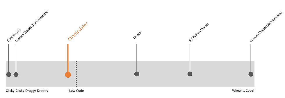
As can be seen above Charticulator falls on the Low Code side of the line, meaning it is a tool that makes it much easier to create your own visuals (Daniel is also the creator of Deneb which is also now in Public Preview).
How I Used Charticulator... one example.
The Requirement:
In a recent build, I needed some way to show my users where a value was positioned within a range of values.
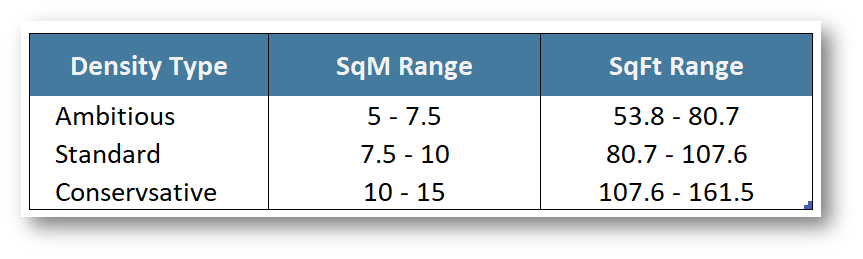
The user needed to enter 2 values, Site Size and Workpoints. These were inputs into a simple measure that calculated Density. The Density Value is then used to calculate the Density Type depending on the ranges in the table below;
This solution needed to be dynamic as the range changes depending on a slicer selection indicating the unit of measure the user chose (SqM vs SqFt)
The Solution:
What I developed was a 'Range Chart'. A floating stacked bar chart which indicated the start and finish range values as well as a triangle that would indicate the 'Density' measure value based on the inputs.
This lets the user see where there 'Density' falls on the range of values and gives them the ability to edit the inputs if they want to achieve a different 'Density Type'.

After trying a few custom visual (Bullet Chart & Box Plot) I realised I would need to build something to achieve what I was looking for.
How it was done
I have created a simplified PBIX to show how the above was created and will reference that going forward. Here are the steps
Install Charticulator from App Source - I wont go through the steps here as its assumed most have imported a custom visual from App Source before. If not then here is the Microsoft support document on it.
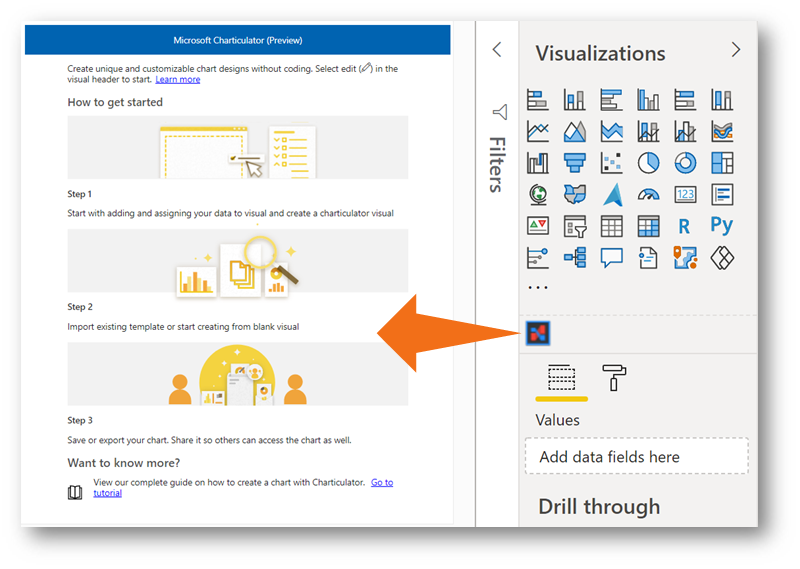
The first this you will see when you place Charticulator on the canvass are the instructions on use as well as links to support information. This is a good place to start to understand the basics of using Charticulator.
To start creating a new chart you need to click on more options>Edit. This then gives you the option to either Import an Existing Template or to Create a new Chart. In this demo we are building one from scratch.

Note: the options to create or import are both 'greyed' out. This is because I have yet to select any fields that Charticulator can use. These wont become available until a value is in the field well.
Setting it Up
Creating the Ranges based on Unit of Measure Selected.
It is best if you have already predetermined what values you will want to use in your visual and consider the way the data has to be constructed to make it work. An easy start point is to get it into a table. This is always a good first foundational step. For this use case I needed a table that held the Min and Max values for each Density Type thus I created a reference table to hold these values and imported it into Power Query

Although predefined ranges were available, these were recorded in Workpoints/SqM. Tus we need a facility to allow the user to change the base unit of Measure from Square Meters (SqM) to Square Feet (SqFt). This can be accomplished in a number of ways. I used a simple SWITCH measure to calculate the MinDensity (UoM): & MaxDensity (UoM): based on the Selected Unit of Measure: in the UOMInput Slicer.
This allowed the creation of a table using the measures where the ranges would change based on the user UoM slicer selection.

Creating the Indicator to value to display over the Range.
The Indicator value is the Calculated Density (UoM): measure. This is simply a measure that calculates the ratio between SiteSize and the number of Workpoints. Note: For understanding Workpoints in this context, relate to the number of areas an office worker can work in. This may be a desk, a table, a seat in a café etc.
Getting the Data into Charticulator
With the Calculated Density Created its now possible to show all in one table (I added the Description as I want that added as a tool tip).

With the table visual selected, click on the Charticulator icon in the visualizations pane. This converts the table to a Charticulator visual and has the benefit of moving the table values into the data well of Charticulator Note: You may need to make a few minor changes as I did here. No values are required in the 'Links' well as that is not needed for the type of visual we are creating.


With the values in the right wells, select more options>Edit to relaunch the Charticulator editor. Note: This time the option to Create chart can now be clicked.
Creating the Chart
I have created a (not so short) video on the steps to create the Chart which is available below.
Conclusion
You can accomplish an amazing amount with with just the standard Power BI visuals or the custom visuals that have been published on App Source. However, there are times when then charts don't do exactly what you need. Charticulator now gives anyone the ability to create their own custom visuals with very little coding knowledge.
It will be very interesting to see what people come up with over the next few months as more and more explore the possibilities of the tool. I hope Microsoft create some sort of community gallery where people can share their amazing creations.
Links
Charticulator - Floating Range Chart on GitHub : You can find the .pbix file as well as the exported tmplt file.
Cost Mark - Digitised Fit Out Guide : an example report embedded where the range chart is being used.
References
Charticulator: Now a Power BI Custom Visual! (with Daniel Marsh-Patrick) : Reid Havens & Daniel Marsh-Patrick do a fantastic job of introducing to Charticulator in Power BI. There are a few amazing examples of what can be accomplished in this video.
Power BI Tips Charticulator Playlist : Mike Carlo has done all the hard work and created a playlist with over 5 hours of demonstration video's to learn how to use. Great resource.


Comments